The interweb has been ablaze in recent weeks with discussion about the anticipated release of iOS 7, expected to be announced at the Apple Worldwide Developer Conference in June. Following the departure of Scott Forstall, there has been much speculation about whether Apple will abandon skeuomorphic design in favour of a more modern “flat design” approach.
“Skeuo what?” we hear you say?
What is skeuomorphic design?
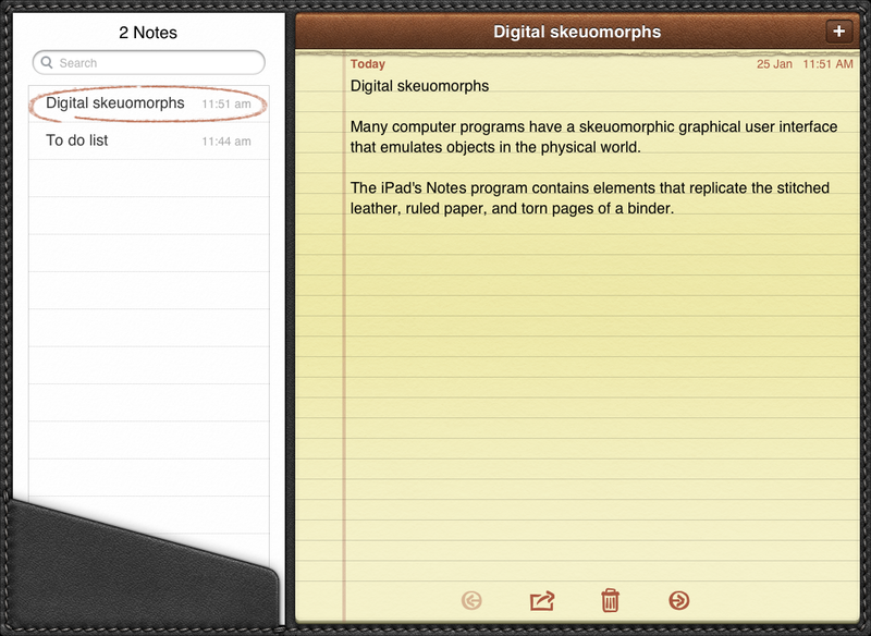
The word skeuomorph, pronounced “skyoo-uh-mawf” is compounded from the Greek words skeuos (container or tool) and morphê (shape). It has been applied to material objects since the 1890s, but more recently it has been used to describe computer interface design.
A skeuomorph is an ornament or design that is made to resemble another material or technique. It is the design equivalent of poetic metaphor. Typically skeuomorphism is employed to make products designed from new and novel materials feel as comfortable and familiar as the objects they replace. Basically, it is a bridge to help us overcome our inherent resistance to change.
Skeuomorphic software design has a short history, traceable to the iPhone and iPad. It is obvious why this is the case, when computers first emerged they relied on punchcards. Later they evolved the capacity to print and display text, and later still rich graphical user interfaces emerged. Graphical desktops have been with most of us since the era of Apple’s Lisa, or for many Windows 3.1. However, the iPhone was the first device to put powerful graphic computing device into the pockets of the masses.
With their gesture driven interfaces and delightful design, the iPhone and iPad are responsible for the pervasiveness of mobile computing. The challenge of making software which is intuitive and effortless cannot be overstated; Apple did a tremendous job in turning everyone from the most tech-savvy Millenials and Luddite Baby Boomers into app-consuming monsters. Skeuomorphism played a big role in this persuasive enterprise by borrowing obvious design queues from the real-world objects which the software sought to imitate.
The problems with skeuomorphic design
What’s wrong with comfortable and familiar design, you might ask? Some argue there really is nothing inherently wrong with it. Indeed, it was necessary for the massive uptake in mobile technology. After all, Palm devices and Windows powered Pocket PCs were around for at least 5 years before to the introduction of the iPhone. But those devices did not ignite the revolution.
However, others have identified at least two problems with skeuomorphic design. First, it is easy to get realism wrong. Realism done wrong is probably best described as kitsch. When pleather and artificial wood-trim are the not exactly the pinnacle of good taste in real life, one might ask what is to be gained by imitation? The other problem is what has been described as the “uncanny valley” of user interface design. This occurs when a design faithfully imitates the appearance of a real-world object, but does not accurately reproduce its functionality.
What is flat design?
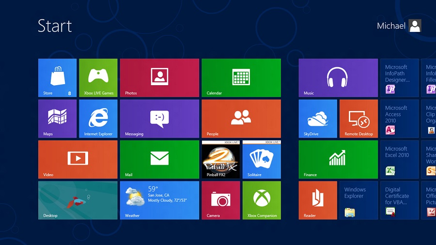
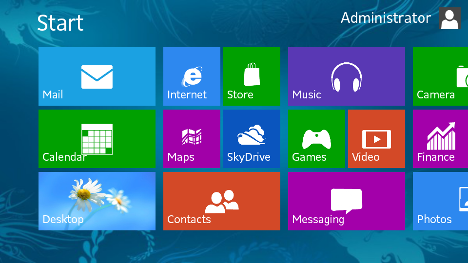
Flat design is the antithesis of skeuomorphism. It is constituted by interface design that does not employ three-dimensional realism or imitation. In a flat design environment, you won’t see bevels, drop shadows, realistic textures of fancy lightening effects. Instead you are presented with visual minimalism, flat colours with no-gradient and an emphasis on typography. Microsoft’s Windows 8 is a great example.
The problems with flat design
The downside to flat design reflect the weaknesses of minimalist design generally. Although many designers profess a deep commitment to minimalism over excessive ornamentation, taking minimalism too far can have serious consequences for usability. In many ways, the pursuit of minimalism embodies the classic quote from Albert Einstein to the effect that we should try to make things “as simple as possible, but not simpler.” When an interface is made too simple, it becomes completely unusuable. When it is not simple enough, portions of the technology using population are left behind.
Another issue is that many users have come to depend upon subtle design queues to navigate their way through digital interfaces. Anybody who has moderate experience in website design, for example, will be aware of the many popular design patterns and the gestalt principles of design. Aside from layout, users have become accustomed to the “fact” that clickable buttons have a slight gradient and rounded corners, form fields have a soft inner shadow, and navigation bars “float” over the rest of the content. Confusion can arise when you remove these affordances and present users with a flat world in which everything feels as though it is on the same level. Users can find themselves wondering, is this a button or simply a banner?
Which is better?
uthinki is not like Playboy, we know you don’t come here just to read the articles. It is time for you to have your say, which is a better paradigm for interface design? Flat design or Skeuomorphism?
Feature Image Credit: Wikimedia Commons